Brewing Tradition
Inspired by the rich traditions of Chinese tea, this branding project combines cultural storytelling with contemporary packaging to create an identity that feels both authentic and approachable.
Inspired by the rich traditions of Chinese tea, this branding project combines cultural storytelling with contemporary packaging to create an identity that feels both authentic and approachable.
Visual Branding
Packaging
Illustration

Project Overview
Type: Personal
Industry: Graphic Design, Packaging Design
As someone who grew up drinking Chinese tea, this project is especially meaningful to me. Jasmine has always been my favorite to drink hot, while oolong is my go-to for iced, and those experiences inspired me to create a brand that shares the beauty of traditional tea with a wider audience.
The packaging draws inspiration from well-known Chinese landmarks, using each one to celebrate the culture and history behind the teas. By combining traditional influences with a clean, modern aesthetic, I aimed to create a brand that feels both timeless and inviting.
Mood Boarding 🎨
Every project begins with establishing a visual direction. For this tea line, I wanted the brand to feel clean, approachable, and contemporary while still honoring its traditional roots. Aligning with my personal style, I chose a minimal aesthetic, rounded typography, and an earthy color palette to create packaging that feels both modern and inviting.
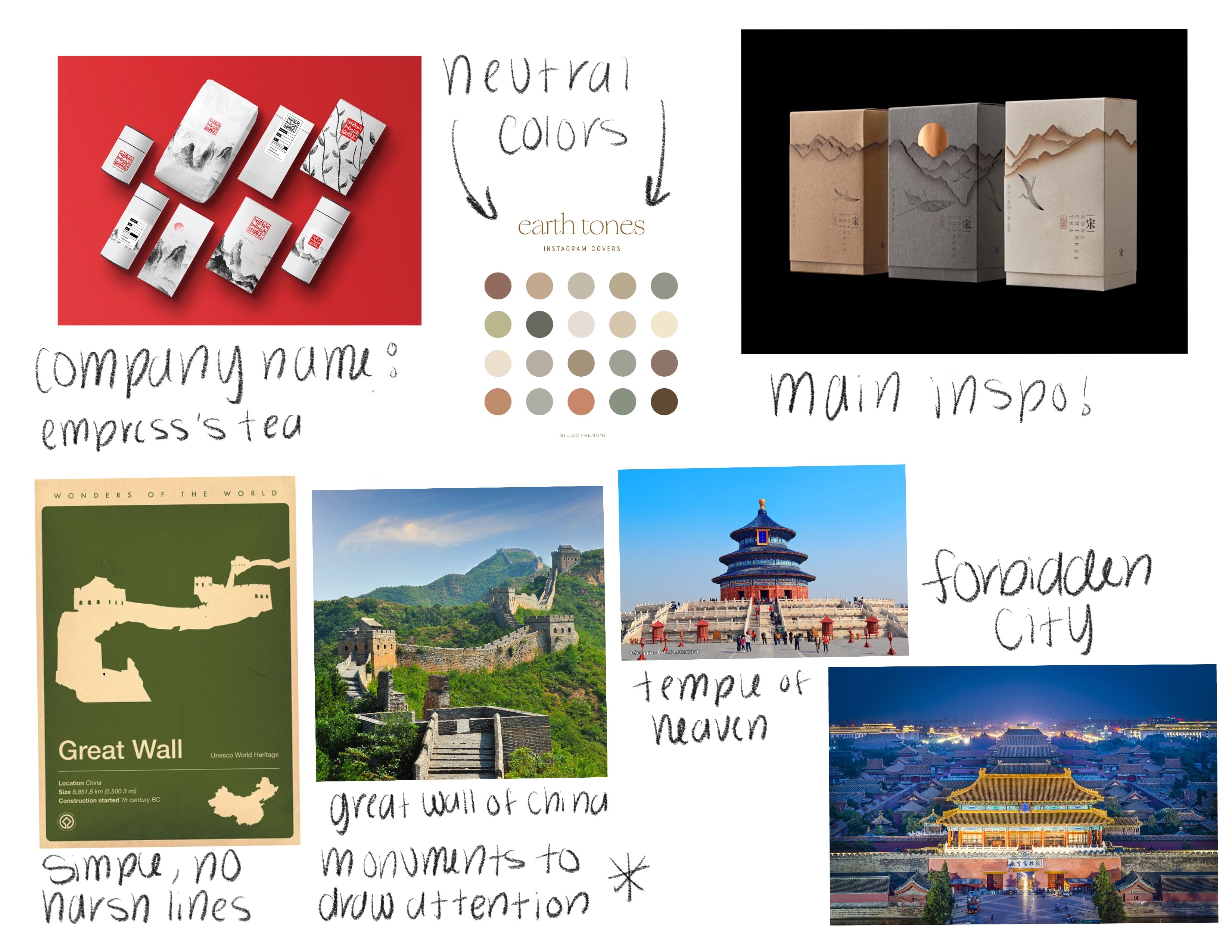
Researching the Story 📖
With the visuals established, I turned my attention to the cultural inspiration behind the brand. I researched some of China's most recognizable landmarks, selecting monuments that would not only be visually distinctive but also help tell a story across the tea collection. Each landmark serves as a tribute to the country's rich history while giving every tea its own unique identity.
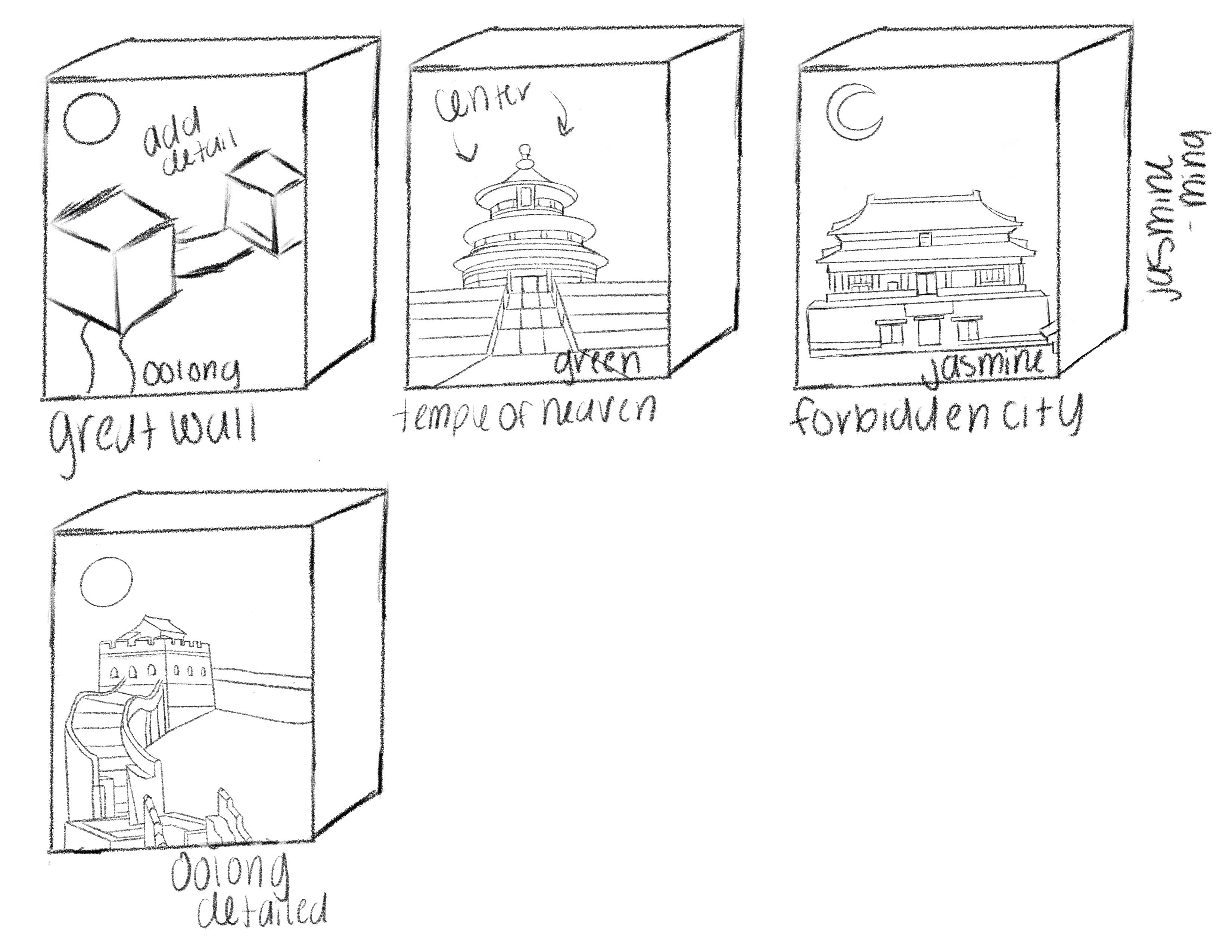
Sketching & Refining ✏️
The project initially began as a three-part series, with each tea represented by a different landmark. As the concept evolved, I refined the Oolong package to become the flagship design, giving it a stronger visual presence while maintaining consistency across the collection. The Great Wall represents Oolong, the Temple of Heaven represents Green Tea, and the Forbidden City represents Jasmine, creating a cohesive system rooted in culture and storytelling.
Design Process & Iterations 💡


Tea for Thought 🍵
This project was an opportunity to celebrate a tradition that has always been meaningful to me. Rather than modernizing Chinese tea for the sake of trends, I wanted to create a brand that respects its heritage while making it feel welcoming to those experiencing it for the first time.
The final identity blends cultural storytelling with contemporary design, proving that thoughtful packaging can preserve tradition while inviting new audiences to discover the stories behind every cup.
Project Overview
Type: Personal
Industry: Graphic Design, Packaging Design
As someone who grew up drinking Chinese tea, this project is especially meaningful to me. Jasmine has always been my favorite to drink hot, while oolong is my go-to for iced, and those experiences inspired me to create a brand that shares the beauty of traditional tea with a wider audience.
The packaging draws inspiration from well-known Chinese landmarks, using each one to celebrate the culture and history behind the teas. By combining traditional influences with a clean, modern aesthetic, I aimed to create a brand that feels both timeless and inviting.
Mood Boarding 🎨
Every project begins with establishing a visual direction. For this tea line, I wanted the brand to feel clean, approachable, and contemporary while still honoring its traditional roots. Aligning with my personal style, I chose a minimal aesthetic, rounded typography, and an earthy color palette to create packaging that feels both modern and inviting.
Researching the Story 📖
With the visuals established, I turned my attention to the cultural inspiration behind the brand. I researched some of China's most recognizable landmarks, selecting monuments that would not only be visually distinctive but also help tell a story across the tea collection. Each landmark serves as a tribute to the country's rich history while giving every tea its own unique identity.
Sketching & Refining ✏️
The project initially began as a three-part series, with each tea represented by a different landmark. As the concept evolved, I refined the Oolong package to become the flagship design, giving it a stronger visual presence while maintaining consistency across the collection. The Great Wall represents Oolong, the Temple of Heaven represents Green Tea, and the Forbidden City represents Jasmine, creating a cohesive system rooted in culture and storytelling.
Design Process & Iterations 💡
Tea for Thought 🍵
This project was an opportunity to celebrate a tradition that has always been meaningful to me. Rather than modernizing Chinese tea for the sake of trends, I wanted to create a brand that respects its heritage while making it feel welcoming to those experiencing it for the first time.
The final identity blends cultural storytelling with contemporary design, proving that thoughtful packaging can preserve tradition while inviting new audiences to discover the stories behind every cup.
