Aura Skin
Aura is a conceptual skincare brand centered around skincare for the spirit. Inspired by moments of calm, growth, and clarity, the brand transforms everyday skincare into an luxurious ritual!
Aura is a conceptual skincare brand centered around skincare for the spirit. Inspired by moments of calm, growth, and clarity, the brand transforms everyday skincare into an luxurious ritual!
Visual Branding
Packaging
Product Design

Project Overview
Type: Personal
Industry: Visual Branding, Packaging Design
Following several vector-heavy projects, I wanted to get out there and challenge myself to design with a different visual approach. Specifically, one more focused on typography, logo creation, and atmosphere as a storytelling medium. Aura is a conceptual skincare brand that transforms everyday routines into intentional, luxurious rituals, centered around three emotional connections: Bloom, Meditate, and Glow.
Mood Boarding 🎨
Dreamy gradients, bold typefaces, and celestial imagery led the direction here as the starting point for fonts, palette, and overall mood.

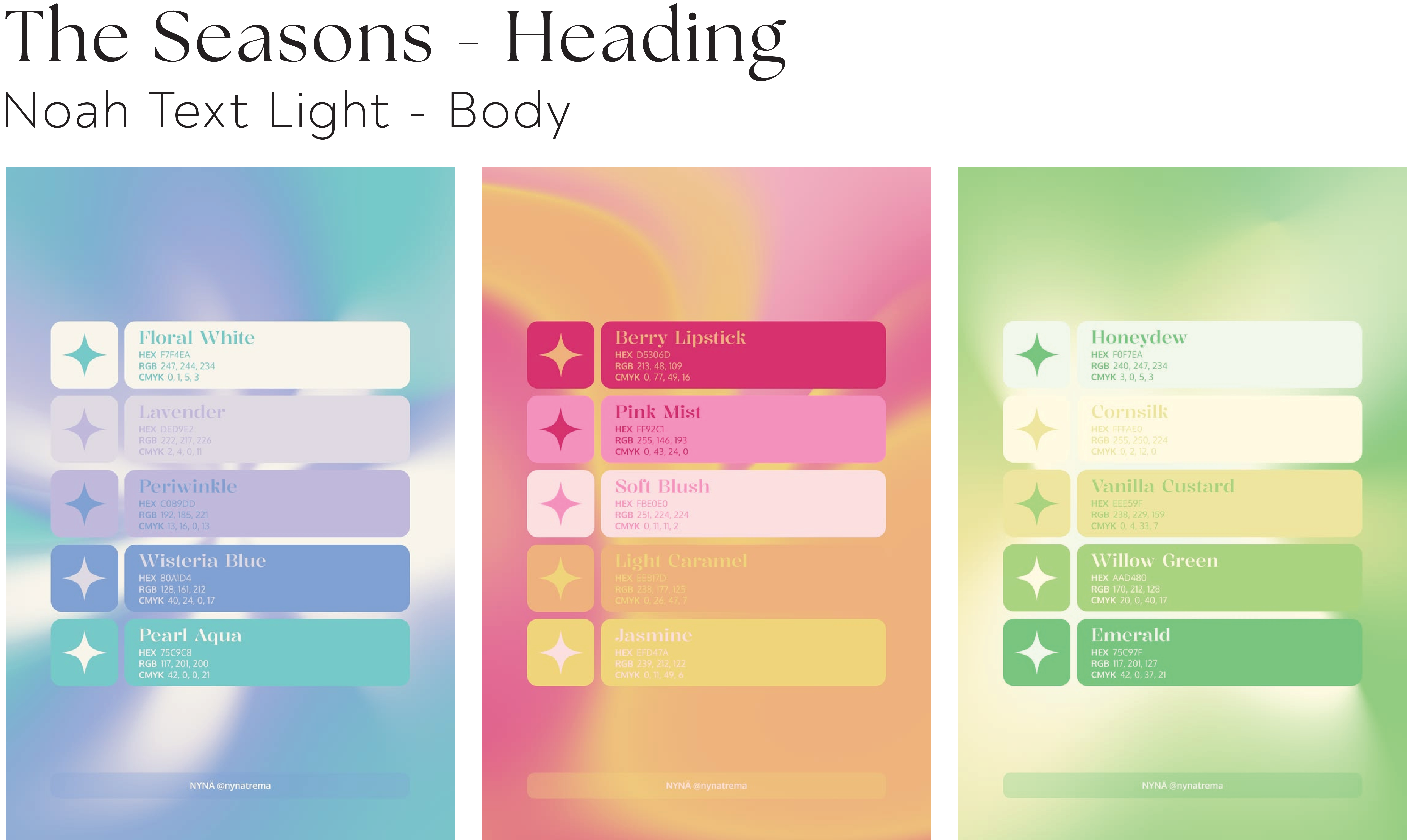
Brand Identity 💫
I knew early on I wanted the logo to incorporate an orbital star motif. I explored several iterations, refining the orbit's placement and the balance between typography and tagline until the mark felt clean, recognizable, and versatile across packaging and digital. A simplified icon extends the mark to smaller touch points, like the Instagram profile mock-up below.

Design Process & Iterations 💡
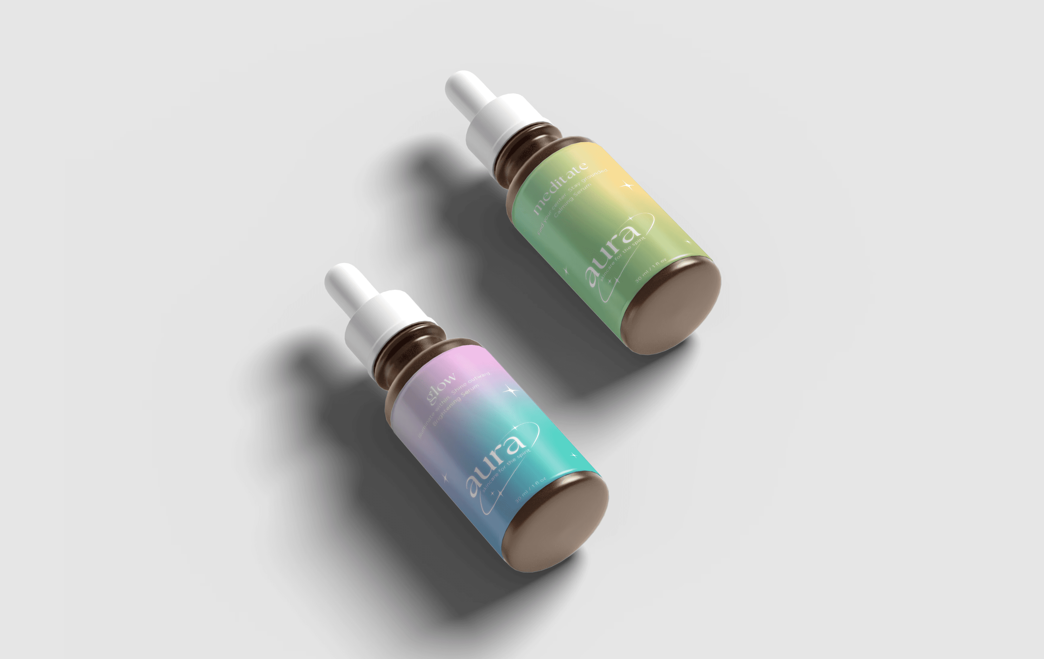
The biggest challenge was packaging that felt emotionally expressive without overwhelming the consumer. Refining typographic hierarchy and letting color lead let each product hold its own personality while staying cohesive as a system.

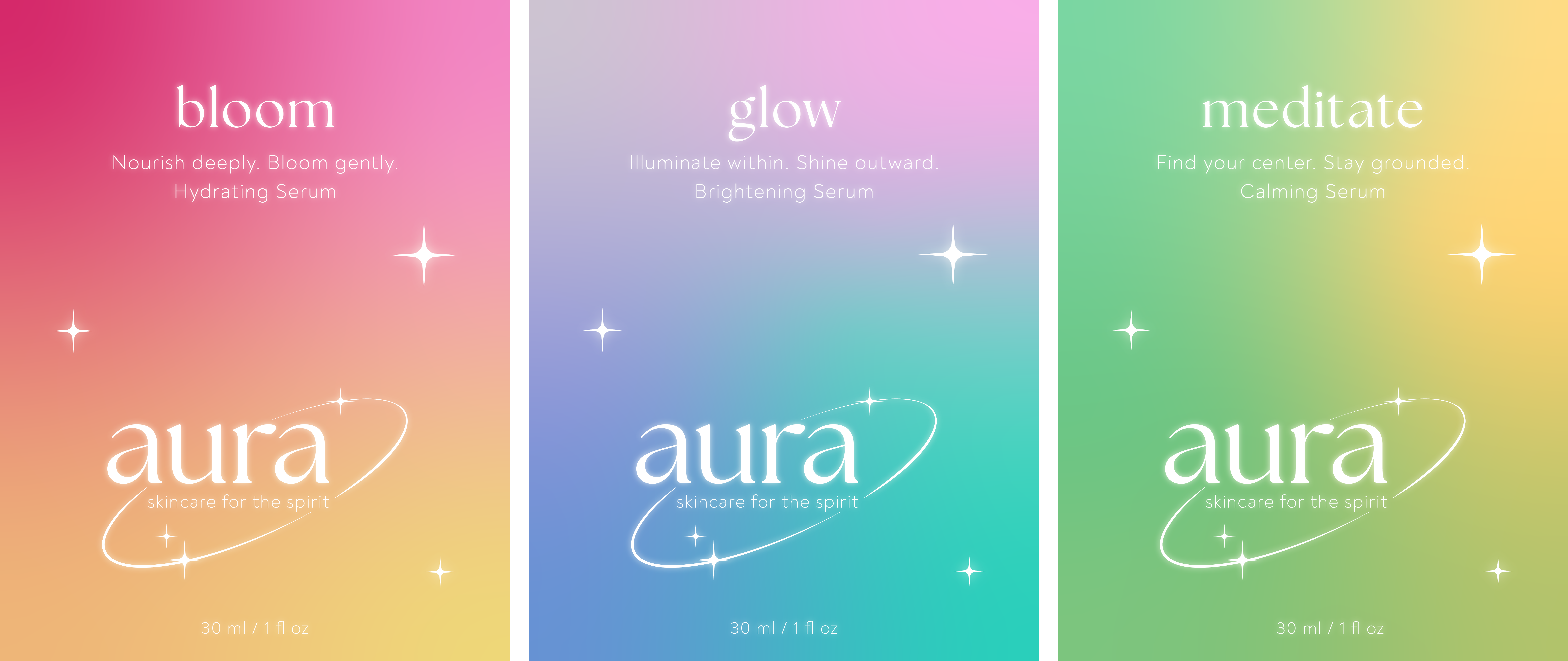
Extending the Experience 🌙
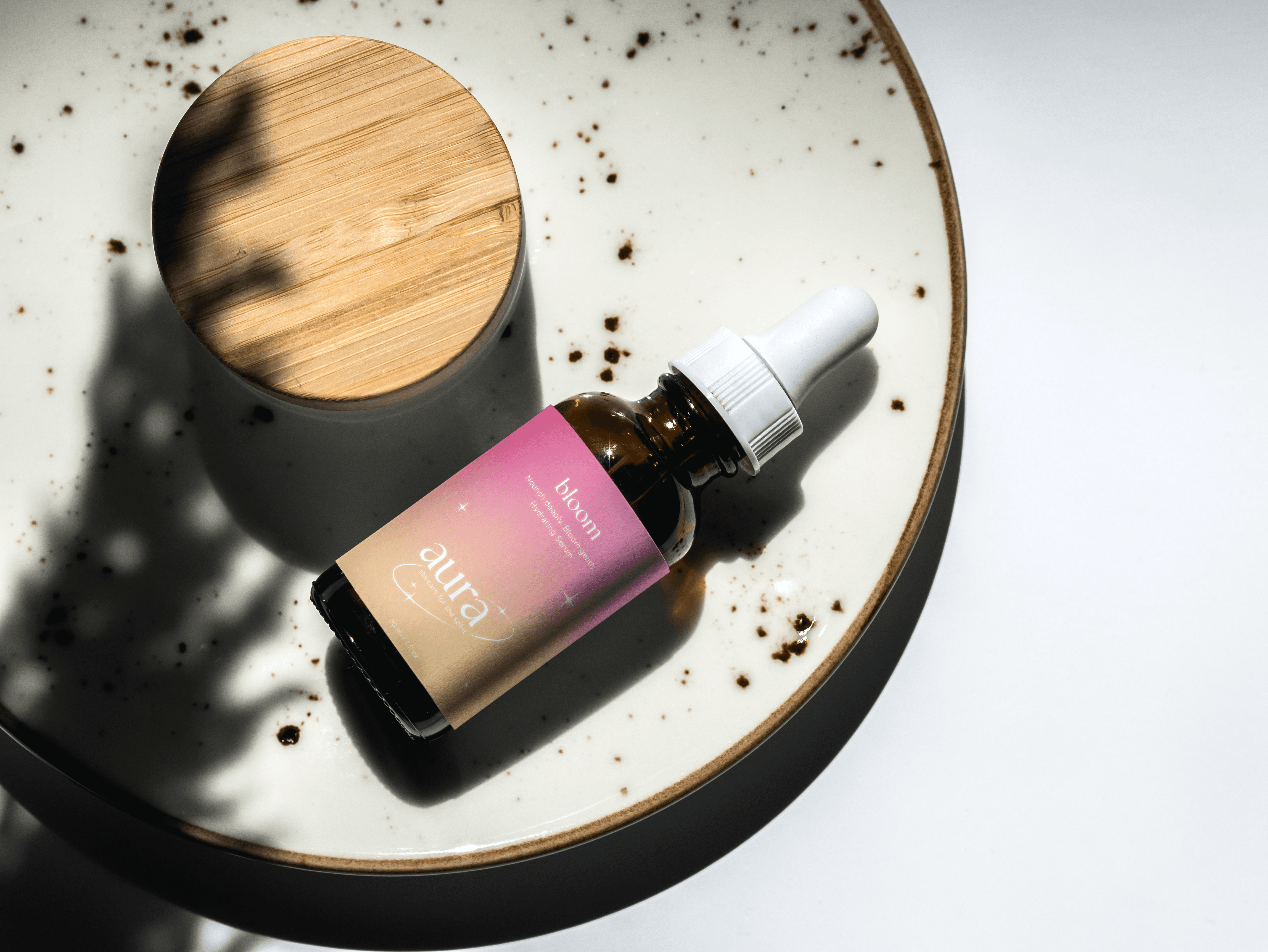
With the core identity established, I extended Aura into product mock-ups and a social campaign introducing the collection. (Note: images used in the Instagram mock-up are sourced from Pinterest.)

The Final Ritual 🪷
Creating Aura allowed me to step outside of my comfort zone and explore a more refined approach to branding! Rather than relying mostly on illustration, I focused on a building connection to the brand through typography, color, and emotion, therefore creating a memorable experience.
Project Overview
Type: Personal
Industry: Visual Branding, Packaging Design
Following several vector-heavy projects, I wanted to get out there and challenge myself to design with a different visual approach. Specifically, one more focused on typography, logo creation, and atmosphere as a storytelling medium. Aura is a conceptual skincare brand that transforms everyday routines into intentional, luxurious rituals, centered around three emotional connections: Bloom, Meditate, and Glow.
Mood Boarding 🎨
Dreamy gradients, bold typefaces, and celestial imagery led the direction here as the starting point for fonts, palette, and overall mood.
Brand Identity 💫
I knew early on I wanted the logo to incorporate an orbital star motif. I explored several iterations, refining the orbit's placement and the balance between typography and tagline until the mark felt clean, recognizable, and versatile across packaging and digital. A simplified icon extends the mark to smaller touch points, like the Instagram profile mock-up below.
Design Process & Iterations 💡
The biggest challenge was packaging that felt emotionally expressive without overwhelming the consumer. Refining typographic hierarchy and letting color lead let each product hold its own personality while staying cohesive as a system.
Extending the Experience 🌙
With the core identity established, I extended Aura into product mock-ups and a social campaign introducing the collection. (Note: images used in the Instagram mock-up are sourced from Pinterest.)
The Final Ritual 🪷
Creating Aura allowed me to step outside of my comfort zone and explore a more refined approach to branding! Rather than relying mostly on illustration, I focused on a building connection to the brand through typography, color, and emotion, therefore creating a memorable experience.