Freshly Picked
A conceptual packaging redesign of Minute Maid's iconic orange juice carton, modernizing the brand through a cleaner visual identity while preserving its recognizable charm.
A conceptual packaging redesign of Minute Maid's iconic orange juice carton, modernizing the brand through a cleaner visual identity while preserving its recognizable charm.
Visual Branding
Packaging
Illustration

Project Overview
Type: Personal
Industry: Graphic Design, Packaging Design
This redesign was inspired by the classic Minute Maid Orange Juice carton that used to come with kids' meals at fast-food restaurants. It was one of my favorite drinks growing up, and revisiting it made me wonder how the packaging could evolve to match the fresh, vibrant taste inside.
My goal was to give the carton a modern refresh while staying true to the original design. I kept its recognizable elements but simplified the layout, refined the typography, and introduced a brighter visual style to create a package that feels both familiar and contemporary.
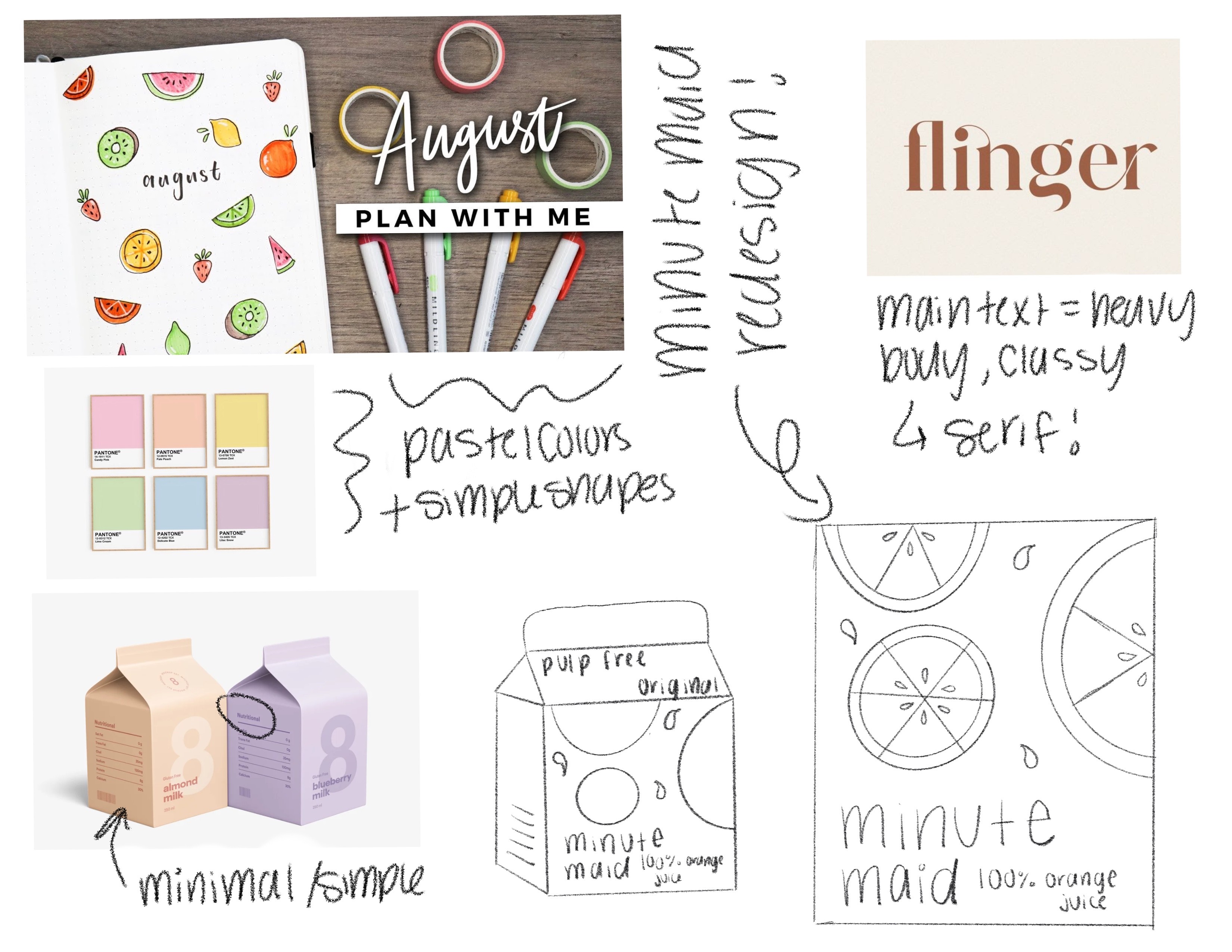
Mood Boarding 🎨
Design Process & Iterations 💡

Each revision focused on improving balance, color, and composition. By introducing additional citrus leaves, refining the layout, and adjusting the placement of each graphic, I created a more cohesive design with stronger visual hierarchy and a fresher overall look.
Worth the Squeeze 🍊
Revisiting a product I grew up with made this project especially meaningful. It gave me the opportunity to explore how thoughtful design can breathe new life into familiar brands without losing what makes them memorable.
The final result demonstrates how subtle, intentional design decisions can transform an everyday product while honoring the identity people already know and trust.
Project Overview
Type: Personal
Industry: Graphic Design, Packaging Design
This redesign was inspired by the classic Minute Maid Orange Juice carton that used to come with kids' meals at fast-food restaurants. It was one of my favorite drinks growing up, and revisiting it made me wonder how the packaging could evolve to match the fresh, vibrant taste inside.
My goal was to give the carton a modern refresh while staying true to the original design. I kept its recognizable elements but simplified the layout, refined the typography, and introduced a brighter visual style to create a package that feels both familiar and contemporary.
Mood Boarding 🎨
Design Process & Iterations 💡
Each revision focused on improving balance, color, and composition. By introducing additional citrus leaves, refining the layout, and adjusting the placement of each graphic, I created a more cohesive design with stronger visual hierarchy and a fresher overall look.
Worth the Squeeze 🍊
Revisiting a product I grew up with made this project especially meaningful. It gave me the opportunity to explore how thoughtful design can breathe new life into familiar brands without losing what makes them memorable.
The final result demonstrates how subtle, intentional design decisions can transform an everyday product while honoring the identity people already know and trust.
